
Personalised colouring book: turning your family memories into a creative activity
By Ilan BinistiCo-founder, Memory Pencil
A beautiful personalised colouring book takes more than gathering your favourite photos. Sharp faces, readable scenes, a coherent story: the full guide to choosing and organising your photos.
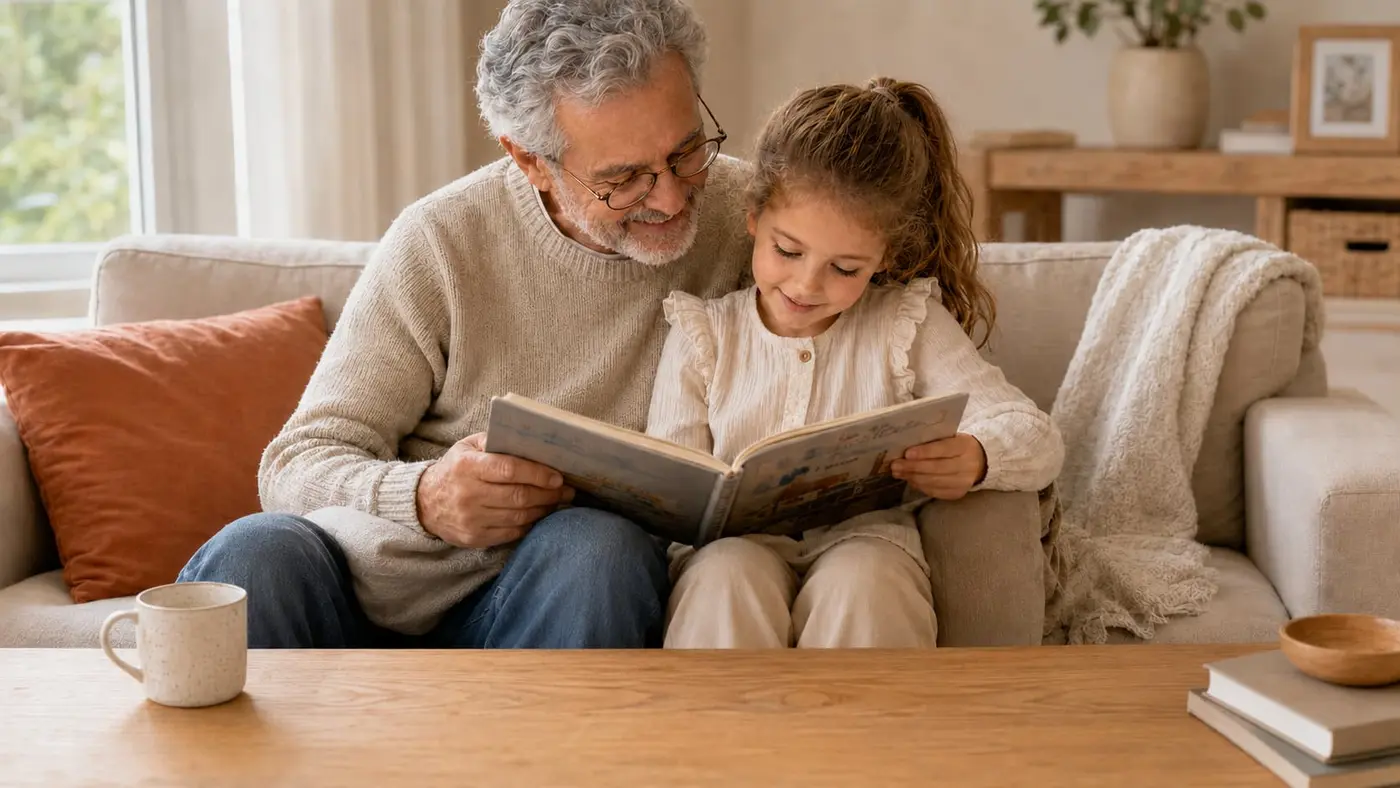
Making a beautiful personalised colouring book takes more than gathering your favourite photos. The images need to be sharp, close enough, and varied. They also need to form a coherent whole, one that tells a story.
The most spectacular photos aren't necessarily the best suited. A simple everyday scene, where people are easy to recognise, often makes a better colouring page than a big group shot taken from far away.
Done well, the book becomes more than an activity book. It brings back familiar faces, revisits moments you lived, and turns family memories into a creative experience.
In short
- Choose sharp, well-lit photos.
- Favour faces that are close enough.
- Alternate portraits and scenes of daily life.
- Organise the images around a theme or a story.
- Set aside photos that are too blurry, dark or busy.
Create your colouring album
Designed in France, checked page by page before printing.
How many memories to transform?
Start by choosing the story the book will tell
Choosing the photos starts with a simple question: what do you want to tell? A personalised colouring book can trace a year, gather the memories of a trip, or celebrate the people who matter to whoever receives it. It can also be devoted to a passion, a pet or a particular event.
Among the possible threads:
- A year in a child's life.
- Family holidays.
- Time spent with grandparents.
- A baby's first years.
- A birthday or a family celebration.
- The people and pets who matter most.
- A passion: football, dance, horse riding.
Fit the content to the recipient
A book meant for a young child isn't built like one given to an adult. The number of pages, the complexity of the drawings and the subjects you pick should match the person who will colour it in.
For a child, familiar faces, animals and simple scenes are good starting points. An adult will enjoy more detailed compositions, landscapes or travel memories. Take their relationship to colouring into account too: someone who colours now and then will prefer a short, varied selection, while a regular enthusiast will enjoy more numerous and more intricate illustrations.
Avoid piling up unrelated photos
A good book shouldn't feel like a folder of images thrown together at random. Every photo should serve a purpose in the story. Before keeping one, ask yourself a few questions:
- Does it bring a different memory?
- Does it introduce a new person or a new situation?
- Does it look too much like a photo already chosen?
- Will it still be legible once turned into a drawing?
This kind of sorting avoids repetition and gives the whole book more rhythm.
Which photos make the best personalised colouring pages?
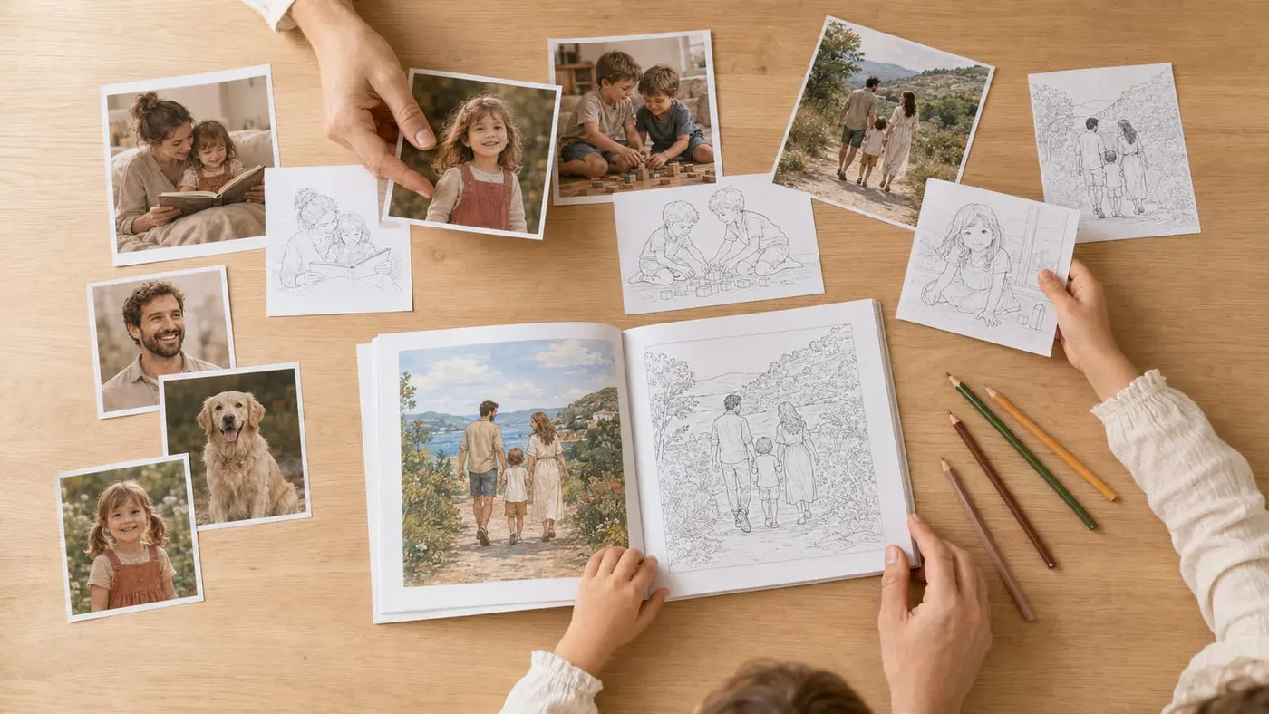
The best photos are usually sharp, bright and framed close enough to the subject. Faces should stay visible, and the main elements should stand out from the background.
Favour natural, even light
Good light makes faces, clothes and postures easier to read. It lets the outlines come through without piling up shadows that are hard to interpret. Better to avoid:
- Strongly backlit photos.
- Faces sunk in shadow.
- Images taken in a very dark room.
- Coloured lighting that hides some features.
- Heavily retouched photos.
A slightly imperfect photo can work fine as long as the main subject stays legible. On the other hand, no processing can recreate the details missing from a face that's too dark or too blurry.
Choose subjects that are close enough
The further a person is from the lens, the less their features survive in the colouring page. Portraits, duos and small groups therefore give the most precise results. In particular, check that:
- Faces take up enough space in the image.
- Expressions are visible.
- People aren't cut off at the face.
- No object hides the main features.
- The subjects don't blend into the background.
Photos taken at the subject's height often work better than images captured from very far away or at an extreme angle.
Beware of scenes that are too busy
A photo can be lovely and still hard to turn into a colouring page. A crowd, a table covered in objects or a very detailed background produce too many lines. To decide at a glance, a few markers:
| Photos that work well | Trickier photos |
|---|---|
| One or two main subjects | A crowd or a large group |
| Close, unobstructed faces | Distant or hidden people |
| Natural light | Strong backlight |
| A simple background | A scene full of small objects |
| A sharp image | A blurry or heavily compressed photo |
| Postures that are easy to tell apart | Overlapping silhouettes |
A group photo isn't ruled out for all that. The people just need to stay close enough, and the background must not take over.
How to keep faces recognizable?
Recognising a face doesn't depend on reproducing every detail. It rests mostly on a few characteristics: the overall shape, the hairstyle, the expression, the glasses or the posture.
A drawing to colour has to strike a balance. Keep every shadow and every strand of hair, and it gets too busy. Simplify the face too much, and the person is no longer identifiable.
Simplify without erasing the defining features
The most useful elements are usually:
- The shape of the face.
- The cut or length of the hair.
- The position of the eyes and mouth.
- A particular expression.
- Glasses, a beard or a distinctive accessory.
- The posture and the clothes.
Faithfulness isn't about copying every pixel. It's about keeping what lets the family recognise the person straight away.
Check faces before printing
Checking matters all the more when an automated transformation is part of the creation. It catches a distorted gaze, a badly interpreted hand, or a line running across the face.
At Memory Pencil, every page is checked before printing. We look at how closely the characters resemble the originals, and at the overall legibility of the colouring page. A preview beforehand is also a good way to see whether your photos give the result you expect. We broke down how the AI turns a photo into a drawing in another article.
Want to try it with one of your photos?
See the result on your own photos with the digital version, then decide.
See it with my photosShould you favour portraits or scenes of daily life?
The two formats complement each other in an album. Portraits make recognition easier, scenes of daily life tell the memory.
Portraits, to recognise people right away
Portraits and duos sit well on the first pages. They introduce the book's main characters and often give clear drawings. They can show:
- The child the book is meant for.
- Their parents.
- Their grandparents.
- Their brothers and sisters.
- Their close friends.
- The family pet.
Not everyone needs to be looking at the lens. A profile or a spontaneous moment works very well as long as the face stays visible.
Scenes of daily life, to give the pages meaning
A run of portraits would end up feeling monotonous. Scenes of daily life bring gestures, places, relationships. They might be:
- A family meal.
- A walk.
- A birthday.
- A reading moment.
- A game in the garden.
- A day at the beach.
- A sporting activity.
For a 12-photo example, a balanced composition might break down like this:
| Type of image | Rough count |
|---|---|
| Portraits or duos | 4 |
| Scenes of daily life | 5 |
| Pets or important places | 2 |
| Symbolic closing image | 1 |
This split is only an example. The point is to avoid a single type of image taking over every page of the book.
Why do everyday photos often make the best colouring pages?
A photo's value isn't only about how it looks. An ordinary image can move you more than a carefully staged portrait, because it points to a habit or a moment truly lived. A few examples:
- A child reading with their grandfather.
- The dog asleep in its basket.
- An afternoon snack in the kitchen.
- A usual walk.
- A game between siblings.
- A parent baking a cake.
These scenes show natural gestures and few characters. So they turn more easily into legible illustrations. They also give the book a real personal dimension: the recipient isn't just colouring a face, they find a situation they know and can tell what was happening.
How do you tell a year of memories in a few pages?
To sum up a year, alternate the big events and the ordinary moments. Birthdays and holidays give you landmarks, everyday scenes keep the whole thing alive.
Spot the anchoring events
Start by identifying the big moments:
- A birthday.
- The first day of school.
- A holiday.
- A family celebration.
- A trip.
- A birth.
- A new activity.
No need to keep everything. A single representative photo is often enough to evoke a whole event.
Add everyday memories
Between those big steps, slip in simpler images: a meal, a game, a trip to the park, a moment with a pet. They keep the book from looking like nothing but a string of celebrations.
Choose a clear structure
Two structures work well: chronological order, from January to December, or a thematic layout, with sections given over to family, friends, holidays or passions. For a 12-photo example, one possible progression:
| Position | Content |
|---|---|
| Page 1 | Opening portrait |
| Pages 2 to 4 | Immediate family |
| Pages 5 to 7 | Everyday moments |
| Pages 8 to 10 | Holidays, outings or activities |
| Page 11 | A passion or a pet |
| Page 12 | Symbolic closing image |
A cover, a title or a short dedication rounds off this progression nicely.
How does a photo become a page that's pleasant to colour?
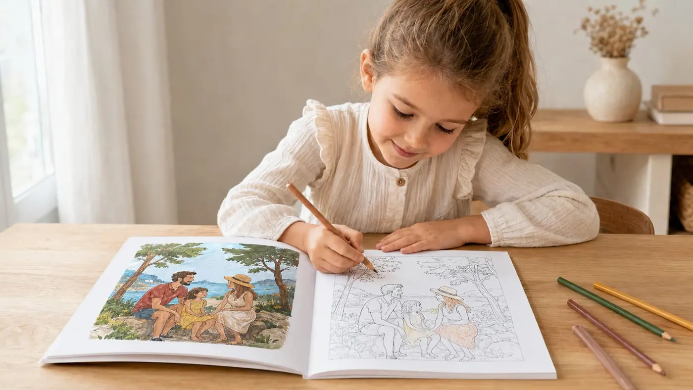
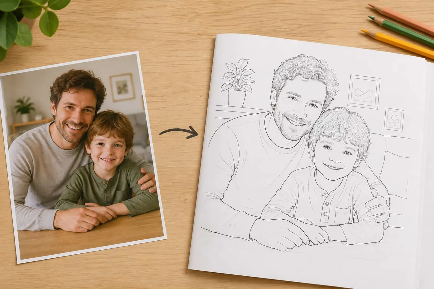
Turning a photo into a page isn't just about switching it to black and white. The image is simplified to produce clear outlines and areas that are genuinely colorable. The process usually goes through several steps:
- Choosing the photo.
- Spotting the main subjects.
- Simplifying the shapes.
- Keeping the recognizable elements.
- Drawing the outlines.
- Removing the unnecessary details.
- Checking and laying out the page.
A fully automatic process can leave open lines, imprecise faces or areas that are far too small. Human review is what corrects these flaws before production. At Memory Pencil, each chosen photo gives two pages: a colour illustration that keeps the memory, and the same scene as line art, ready to colour. The colour version can serve as a model, but everyone stays free to pick their own colours. If you'd rather keep it all on screen, we also offer a digital version as a PDF.
Create your colouring album
Designed in France, checked page by page before printing.
How many memories to transform?
Frequently asked questions about personalised colouring books
How many photos should you plan for?
It depends on the recipient and the subject. A short, coherent selection beats a large number of repetitive images. Six photos are enough for a first book, while twelve or twenty-four let you develop a fuller story.
Can you use old photos?
Yes, if they're properly digitised and the faces stay legible. Avoid prints photographed at an angle, with reflections, or at too low a resolution.
Do group photos work well?
They can work if the people are close enough. A photo of four or five well-framed people will usually be more legible than a whole class shot from far away.
Can a blurry photo make a nice colouring page?
A little softness isn't necessarily a problem. But if the eyes, mouth and outlines of the face are indistinguishable, the likeness will be hard to preserve.
What's the difference between a colouring book, a colouring album and a personalised colouring book?
These words are often used as synonyms. The difference is mostly about format, binding and presentation. The word album leans more on the keepsake side, while book points more directly to the colouring activity itself.
Can you get the book as a digital version?
Yes. The digital version delivers the pages as a PDF: you keep them and print them yourself as many times as you like.
In short
A beautiful personalised colouring book isn't built only from the most impressive photos. It rests on a balance between portraits, scenes of daily life and everyday memories, organised around a clear story. Before putting the whole book together, you can see the transformation on one of your photos with the digital version. That preview checks the framing, the light and the level of detail before you choose the other images. To go further on sorting, we gathered all the criteria for choosing your photos in a dedicated guide.
Our personalised books made from your photos
Three ways to turn your family photos into an activity book, from free colouring to guided play.
- Personalised colouring bookEach photo becomes a colour keepsake page and the same scene to colour freely.
- Personalised colour by numberYour photos as numbered zones with a colour legend: guided colouring, true to the memory.
- Personalised dot to dotThe drawing of your photo appears as you connect the numbers, then gets coloured in.
Ready to turn your photos into a colouring book?
Designed in France, checked page by page before printing.
See the formats and create my bookGift ideas related to this article

Personalised gift for grandma
For Christmas, her birthday or Grandparents Day: a personalised colouring book made from photos of her grandchildren.

Personalised gift for grandpa
Grandpa hates gadgets? For Christmas or Grandparents Day, a personalised colouring book with his grandchildren.

Christmas gift for grandparents
A Christmas gift that actually moves grandma and grandpa: their grandchildren turned into a colouring book.
Read next
Practical guide
Personalised colouring book prices in 2026
Compare printed and PDF colouring book prices, cost per photo, included services, and the details to check before ordering.
Practical guide
Line-art render: how to keep your photo true to the real scene
The most lifelike line drawing doesn't come from a magic filter. It's decided when you pick the photo: a full frame with people uncropped, and a calm background. Here's how those two choices keep the drawing close to the scene you lived.

Practical guide
Colour by number: how it works, and who it's for
The colour by number from your childhood, but made from your own photos. How we split an image into numbered zones, who it speaks to, and what changes compared with the classic colouring book.